ParfumAholic
Reviews
Filter & sort
 ParfumAholic
Translated
Show original
My journey into a world I don't understand - Ishtara
Isn't it said that the best is saved for last? Unfortunately not here. Finally, an uninspired mix of diffuse flowers, light woods and a certain basic sweetness (without being overly sweet). The advertised exotic woods are not apparent to me and although I read labdanum in the pyramid, I miss it in the fragrance. Common mainstream, which doesn't hurt, but is also a long way from fragrance enjoyment.
*
And that was it, my journey into the world of Ishtara.
21 fragrances rated on average with a 6 - not an overly exhilarating score.
Apart from a very few "highlights", absolutely nothing that will stay in my memory in terms of fragrance.
This of course raises questions. Especially the question of why? I think that I simply don't belong to the target group of the house, which is strongly oriented towards the current mainstream. Many younger fragrance noses will probably feel quite differently about what often bothered me. And before any nasty criticism comes my way: I didn't mean that in a nasty or derogatory way. However, I think that a certain "synthetic habituation" has now set in, which seems quite normal for many people. But that's also just a limp attempt at an explanation. As always, everyone should and must form their own opinion.
* If anyone is interested in the complete set (but only completely or not at all), please let me know!
33 Comments

Translated
Show original
Well and loudly roared lion
Ever since I joined Parfumo, I've been really taken with the Les Exclusifs fragrances from Chanel. I appreciate the high quality and unagitated nature of the fragrances, which for me are classic and timeless. Just like the world-famous bouclé jackets and the 2.55 bags, they will probably never go out of fashion.
The fragrances are never loud or have extreme / special corners and edges. They seem to fit naturally into the Chanel cosmos and skilfully complement / round off the highly noble range.
And so it was of course clear that the new "Le Lion de Chanel" directly got a fixed place on my watch list. However, obtaining a sample / bottling turned out to be very difficult, as the fragrance was probably only launched in the Middle East at first. So I was all the more grateful to a dear perfuma who sold me a bottling.
Needless to say that I have not put off the scent test ;-))
Immediately after spraying on, heavy, dark and very smoky leather appears, which has probably also got some resinous stains. Leather is not listed in the fragrance pyramid, but I can't imagine that only the listed Labdanum could have such leathery properties.
I have to admit that this very opulent leather opening is almost too much for me. Also my thought (my hope) that this will be only briefly in the top note should prove to be wrong. I find this leather to be very brute and dominant. And it might not fit to Chanel at all for me. Rough leather boots / leather jackets to thin Chanel dresses or strict black and white looks might work as style-breakers, but then I would rather imagine the smell of fine suede.
Little by little, spicy patchouli is added, which only minimally reduces the somewhat coarse impression.
Olivier Polge then smuggles vanilla in through the back door. Smoky vanilla that makes me think directly of Shalimar. Not quite as powerful as Guerlain's classic, but a certain relationship cannot be denied
So it smokes and steams around me for hours and I don't know exactly how to find it now. Actually I thought that the leather theme had had breakfast with Chanel's Cuir de Russie. Then why this leather scent? And as I indulge in this thought, the leather whip noticeably slackens and the scent changes into a warm, almost balsamic base. Here the smoky leather more or less well-behavedly classifies itself and now also leaves room for the vanilla (which has obviously lost its smokiness) to unfold. Despite all this, it won't be a cuddly scent, but rather a harmonious leather scent with a soft and unsweet vanilla base.
Just towards the end I like the Chanel Lion. Even though the scent still has a rather darker aura. This new one from Chanel is really different and leaves the known Chanel fragrance paths or adds new facets to them. The fragrance will not be part of my collection, but I like to acknowledge that one has dared to try something new.
30 Comments

Translated
Show original
Beauty and elegance
This comment and my evaluation of the fragrance refers to the eau de parfum. But since the EdP is not listed, I place the commi here under the Extraît.
The Henry Jacques brand, like probably some others, was not really known to me. Only through the sharings of widow Bolte this should change.
The net does not really give much information about the traditional house. For a very long time, they have exclusively produced tailor-made fragrances to customer order. That sounds elitist. It probably is. But if I'm completely honest, it would be a real dream come true to have my very own personal fragrance created. It was only little by little that I (hesitantly) opened up to the general public. But "broad public" is not really true, because the branches are rare and apparently very select. In Europe the fragrances are apparently only available at Harrod's. The habitus of a private and exclusive fragrance manufactory has at least not been discarded in the house of Henry Jacques. Harrod's calls prices from about 500€ to over 2.000€ for the fragrances. This is an announcement. Such a price policy protects of course also from the fact that the fragrances are spread. But before I would dig so deep into my pockets, a lot, a lot would have to happen. But I don't want to ride around on prices any longer. Everyone has to classify that individually for himself.
But now to the fragrance itself. Blue vanilla is a total work of art, which makes it almost impossible for me to break it down into its individual components.
The scent starts somehow "fresh", although I couldn't say which scents could be responsible for it. It is not a normal freshness, rather a bright and friendly impression with a touch of sweetness. The "aromatic notes" indicated in the pyramid could be it.
This is immediately followed by light and spicy, fine tobacco. This is easily recognizable and is also a constant over the entire fragrance process.
Dry, light woods lie under the tobacco. Very fine and subtle.
Very fine-smoky, spicy vanilla and ultra-fine, very light musk finally cover all components like a veil, enmeshing and cross-linking them.
In general, Blue Vanilla is a densely woven fragrance in which there are no real soloists. The scent seems more like an orchestra to me. You can recognize individual instruments here and there, but the big picture is what counts.
Blue Vanilla is pure and natural elegance and beauty for me, but at no time does it seem arrogant or smug. Nothing seems artificial here and nothing is displayed here. The fragrance radiates sovereignty, everything loud and ordinary is simply foreign to it. This also manifests itself in the projection, which is rather moderate and close to the body. Blue Vanilla enters into a symbiosis with the wearer, nestles up tightly and gives an incredible feeling of security. In a certain way, Blue Vanilla thus appears as shy of publicity as the house of Henry Jacques itself.
The quality standards of the company are clearly visible. There is nothing off the peg here. And certainly these fragrances would not fit into a 08/15 assortment of any perfumery. But they would fit into that of a few German big players (Alsterhaus / KaDeWe / Breuninger). Especially since trips to London are rather risky at the moment.
Maybe Henry Jacques will have mercy one day...
13 Comments

Translated
Show original
Repeated Resurrection - or Deadly Said Live Longer
I remember very well how much Gucci pour Homme grabbed me back then. This mixture of papyros, clear, but oh so seductive frankincense and absolute soft focus in the base has fascinated me standing foot. Gucci pour Homme was never and never wanted to be subtle, but to spray cool sexyness in an elegant way that absolutely suited the then Gucci creative director Tom Ford. Not to mention the bottle. This heavy glass block with the corrugated bottom was certainly no hand flatterer, but nevertheless incredibly sexy, angular, angular, masculine and very noble.
What a shock when the scent was set. It was even more shocking that I had sold a bottle in ignorance because I had somehow smelt myself full. But afterwards you are (almost) always smarter.
So began the Gucci pour Homme - free years. Here and there flacons appeared in the bay - at moon prices that I was not willing to pay. At some point I was able to get hold of a 30ml bottle, which I have kept like a treasure since then and only use "for good". Whereby strictly speaking this is nonsense, because the smell doesn't get better by standing around....
But there seems to be someone else that this scent won't let go of: Michel Almairac. Creator of the Gucci pour Homme, who also lifted Bentley for Men Absolute and Papyrus Oud from the cradle of fragrance. That's what I call a real passion when a perfumer doesn't want to let go of (s)a scent.
Bentley for Men Absolute is something I would never have come up with without Parfumo. I haven't consciously perceived the scent anywhere. For me a perfect replica of the original with a beautiful base.
And now Papyrus Oud, who should have been the original Gucci pour Homme, Tom Ford wouldn't have wanted any changes. Strictly speaking Papyrus Oud would be the original Gucci pour Homme :-o
All three fragrances contain incense and papyros to create this absolute and unmistakable Gucci pour Homme feeling. The further design then proceeds somewhat differently, but the basic DNA always remains recognizable.
But Papyrus Oud does not want to become soft or cuddly at any time or hour. It remains in the name-giving frame. Not harsh or even scratchy, I would rather describe it as sober, straight and a little distant. This sensual warmth of the GpH can be found here in vain.
Gucci and Bentley probably make the leap to sexiness just because they both build a bridge between frankincense and papyrus on the one hand and soft focus like sandalwood, tonka and vanilla on the other.
Since exactly this does not happen with Papyrus Oud (or only in the smallest musk measure), Papyrus Oud stands out clearly from the other two smells.
I find all three fragrances very successful and would wear any of them, but my personal ranking is quite clear:
1st place: Gucci pour Homme
2nd place: Bentley for Men Absolute
3rd place: Papyrus Oud
For those who like the old Gucci pour Homme (and are looking for a good alternative), the two replicas are definitely recommended.
Merci Monsieur Almairac!
14 Comments

Translated
Show original
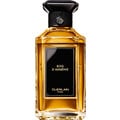
World Heritage Fragrance? Fragrance World Heritage! (or: True beauty is imperishable!)
Who knows me a little, knows that I am very fond of the house Guerlain. If the scents of modern times don't always manage to inspire me, it's the old classics that fascinate me more and more.
At the beginning of my perfume days, I found many such fragrances simply old (fashionable) and not exactly appealing. But that has changed fundamentally. Lucky for me. The more intensively I have dealt with fragrances, the more unimagined worlds of fragrance opened up - especially with the classics. Probably just takes time to grow into. So the "Parfumo-Bildungsauftrag" was a success ;-))
A few days ago the inconspicuous sample of the Jicky Extrait fell into my hands by chance. The EdT and EdP I know and appreciate very much, in so far the extrait test was only a logical continuation of this series.
The Extrait starts directly with the lavender whip, which carries a few citric sprinklers with each turn. One must endure this prelude and/or I simply times. Probably this opening is also due to the year of origin.
The animal is also right there. At first anything but a purring kitten, rather a hissing big cat. But still well-bred. She knows how to behave and deal with her strength.
After this very fulminant start, the fragrance becomes visibly calmer and softer without becoming boring or even arbitrary.
Delicate rose and flowering jasmine are well complemented by the somewhat bitter iris root to avoid drifting into an all too common floridity.
The animal is still present and slowly enters purr mode.
The further the fragrance progresses towards the base (this fragrance deserves the term quite rightly), the more balsamic, softer and rounder it becomes
No more thought of the scratchy lavender (at best still as a hunch), but now super soft guerlinade, soft unfortunately, fine spices and slightly resinous amber-colored amber. And under everything lies the now gently purring kitten.
Jicky - what a beauty and what a delight! It is almost unbelievable that this fragrance is so old and yet not old-fashioned. A timeless and ageless beauty that simply convinces. And I don't have to beat any capers for that. Jicky has an immense power without being loud. Jicky touches heart and soul, is comforting, demanding and enveloping at the same time. Jicky is pure seduction without being offensive. Jicky's... so much more and actually impossible to describe. A fragrance that must be experienced.
Jicky - a fragrance for women AND men who want to experience the balancing act between yesterday and today.
Thank you Guerlain!
14 Comments