The Jil Sander boutiques are always a special place of tidiness and tranquility for me. Nothing that distracts the eye, no unnecessary frills, the noble fabrics hang in rows along the bright walls, warm light invites you to linger. No hustle, no rummaging through piles of clothes. The spirit of the legendary guardian of aesthetics, the uncompromising nature in terms of design, presentation, and quality is still clearly palpable even years after Jil Sander, the Queen of Less, has left.
So I was all the more excited to get to know the new fragrance line of the house in the store on Königsallee in Düsseldorf, which is supposed to represent the style of the house.
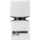
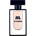
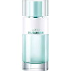
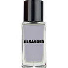
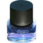
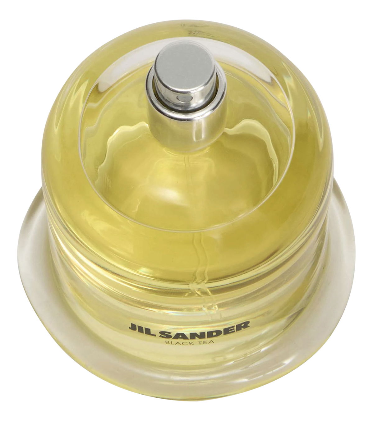
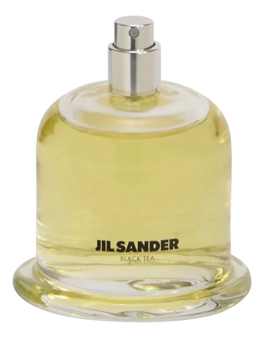
The entire line is presented soberly, coolly, and unpretentiously in the center of the store. White flacons on a white background - this kind of presentation is of course not surprising and I really like it.
What I like less are the white lacquered metal covers, which leave room for interpretation, but are supposed to protect the (allegedly) mouth-blown flacons from light exposure. A plausible explanation, but I personally do not like the implementation at all. More on that later.
My "objects of desire" were "Black Tea," "Coffea," "Earth," and "Smoke" (although I have already had the chance to experience Black Tea through a sharing).
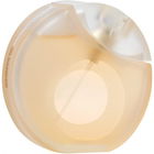
Black Tea indeed starts with dark, spicy black tea. One could almost think they have the hot steam and aroma in a cup in front of them. Spicy cinnamon soon joins in. Fortunately, there is no "Christmas feeling" at all.
The tea notes gradually fade (without completely disappearing) and make way for the typical osmanthus notes, which now take over the fragrance and make it brighter.
However, I find that this gives the fragrance an almost too sweet direction (I consciously do not want to use the term sweetness here), which I think was unnecessary.
As strong as the fragrance starts, it also loses intensity in the course of the scent. It never becomes skin-close, and while it is still perceivable, it "blurs" a bit and appears slightly shapeless.
Conclusion: It’s okay, but from my perspective, there are definitely better tea interpretations with more character.
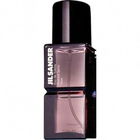
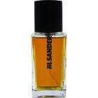
Now to the flacons: The glass flacons are quite nice to look at, round and with air bubbles in the glass. They fit well in the hand, and the spray heads work flawlessly. Instead of the usual caps, white lacquered metal bells are placed over the flacons to protect the contents from light exposure. This makes sense, but the implementation does not necessarily appeal to my taste, as it looks very "organic." I would be very curious to know what Jil Sander herself would say about this…. But as we know, taste is subjective.
Here’s an excerpt from the American Vogue featuring Lucie and Luke Meier, the chief designers of Jil Sander, discussing the flacons:
Quote: "Of course, the bottles themselves are a statement. Made in collaboration with FormFantasma, each of the glass flacons is perfectly imperfect and is meant to show bubbles and other things that were once considered imperfections in the industry. 'We felt that this gives the bottles a lot of soul and adds a human touch,' says Luke. 'Packaging can be very industrial, and we wanted to make it artisanal.
Instead of a cap, each bottle comes with a white porcelain bell that fits perfectly. It is incredibly satisfying to put it on and take it off. 'It felt very human to create this gesture of putting the cap back on after use,' says Lucie. It is also practical - sunlight can quickly spoil a fragrance, and the opaque cap prevents possible damage. 'We liked the natural colors of the bottle and the fragrance, so this was our solution.
Formafantasma is a research-oriented design studio that examines the ecological, historical, political, and social forces that shape the design discipline today. Whether designing for a client or developing self-initiated projects, the studio always applies the same rigorous attention to context, processes, and details. Formafantasma's analytical character is reflected in careful visual results, products, and strategies." (End of quote)
All in all, I can say that the tested fragrances did not completely convince me. They are far from bad, but also not the big hit I had hoped for. In terms of quality, they are perfectly fine and certainly worth the €230 for 100ml. The design (apart from the strange "bells") is also acceptable, and the fact that they are refillable flacons fits with the sustainability mindset of our time. Only, unfortunately, the fragrances will not remain sustainably in my memory.


 Black tea CO2
 Sri Lankan cinnamon
 Chinese osmanthus
 Aldehydes


 Mon881
 ParfumAholic
 Heikeso
 Parma
Parma DasCroe
 DANA17
 CharlAmbre
 ForeverJil
 Ooonidda
 Annabraucht